

For many businesses, their website is often the first introduction they have to a customer. Therefore, it stands to reason that the website must stand out, make a good impression to that customer and promote them and their products/services in a positive light.
With this in mind, there are some errors, mistakes and “no-no’s” which are made time and time again in web design but which should be avoided if the business in question is to make the impression they wish to.
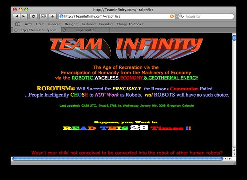
Overcrowding
Because of the fact that many web design packages only offer a capped number of pages, many businesses try to overcrowd their pages by trying to cram as much information as possible into the allowed space. Although this might sound like a good idea in theory, it can backfire spectacularly as the web pages are confusing, hard to read and generally a turn off rather than a turn on. In this instance, the phrase “less is more” is best observed.
Too little information
In direct contrast, too little information can be just as hazardous as too much. Many businesses try to appear “arty” by adding a few words on each page without actually giving their customers any information but this can also have a negative effect as the attention of the customer is not grabbed and they may go elsewhere.
Poor formatting
A further common mistake is poor formatting which makes a website hard to read. Whether this involves moving text, pop-ups, cookie policies or simply poor colour contrasts it will all lead to the same conclusion. A customer or potential customer who finds the format or design of a website irritating or annoying is likely to log off as they lost patience with the elements they dislike. However a website which is easy to navigate and read is more likely to hold the attention and this is vital to success.
Poor navigation
As part of the website design, a designer should consider how the customer will navigate their way around the website. As has been stated above, a customer who is annoyed by the layout will quickly leave the website and search for an alternative and the same is true of a website which is hard to navigate around. Therefore, alternative pages and links should be set out in order that they can be found quickly with little effort on the part of the customer. The key is to get the customer to become engaged with the business who owns the website as quickly as possible and therefore the longer they remain on the website in question, the more likelihood there is of this happening.
Guesswork
From the second they log onto a website, a customer should be aware of the purpose of that site and the business who hosts it. Many businesses make the mistake of having an unclear site purpose and this prevents or delays the process of engaging.
In conclusion
The key to any web design is to ensure the best possible experience for the customer or visitor, and therefore any web design should be completed with their needs in mind.
Sean McCoy is a web designer, freelance writer and blogger.