

A college professor would always tell his students that if they make PowerPoint presentations for their reports, they make sure that the presentations are clean and simple.
What he meant by clean and simple is plain background, a sans serif font, and few images—his presentations being always in white background, navy blue Arial font, one or two charts, and nothing more.
“After all, what is important is the content,” the professor would say, “not the visual presentation.”
The professor is stern and minimalist, if he had style at all. Nowadays, minimalism is prevalent: food labels, book cover, movie posters, t-shirt prints, everywhere. It is straightforward, easy to understand, and of course, no excess details: only the essential for easy comprehension—like figures of a man or woman on comfort room doors without the need for words, “Men” or “Women.”
But minimalism needs not to be boring at all.
What we did was take the professor’s minimalist suggested requirements for PowerPoint presentation and flare it up only a little bit.
Background – There’s a beauty in simplicity. Plain is basic but you can always change the colors and add little designs like slender frame or little drawings, as long as they will not obstruct the texts.
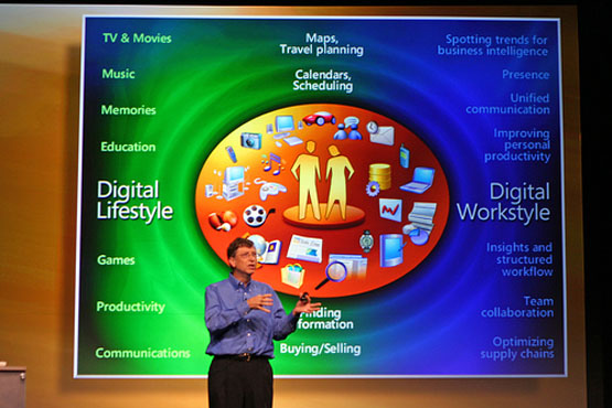
Images – Only the necessary images. If the presentation is about animals, put only pictures of the animals and related facts like photos of their habitats. If it is about statistical data, put a pie chart, diagram, or table. No rage meme.
Fonts – They should be big. Boring fonts like Arial, Helvetica, Verdana, Georgia are commonly used because they are good for the eyes. Thin fonts like Garamond and Times New Roman are only good to read in print. Intricate fonts like scripts and Comic Sans are only good for special occasions like wedding invitation or children’s party banners.
Colors and Themes – There are no specific requirements, only that the background should be darker, while the text is brighter. PowerPoint presentations are mostly done in dim rooms. It hurts the eyes to see a glaring bright square in the dark.
Texts – Put only a list of keywords or important two-liner statements, not section paragraphs. No one likes to read long passages on slide presentations.
Special effects – Special effects are mostly for emphasis. Use them sparingly. No would care if every text is blinking and every slide is flashing. If used lavishly and carelessly, special effects can be annoying and lose their effect.
PowerPoint presentations can also show the personality and humor of the reporter. If you like Hello Kitty, no one is stopping you from making candy pink themed presentation. Entertainment can be of value, but only next to the content.
The important thing to remember is that PowerPoint presentations are only accompaniment to the report or lecture one has to give. The content of the report does not have to rely on the presentation, but on the presenter himself.
Minimalism is essential here because if you put everything in it, might as well have the presentation itself and no more presenters.
Jasper Dela Cruz is a business blogger. He blogs for officekonsulenterne.dk. They focus on equipping business owners with business software knowledge. Aside from blogging, Jasper is also a toy enthusiast.